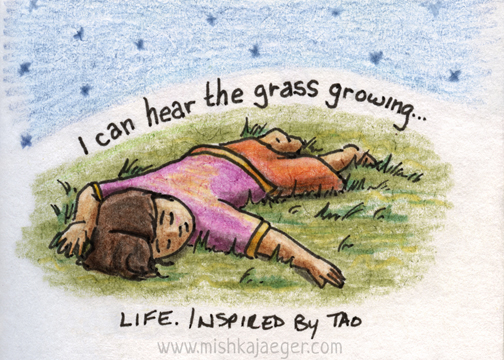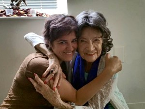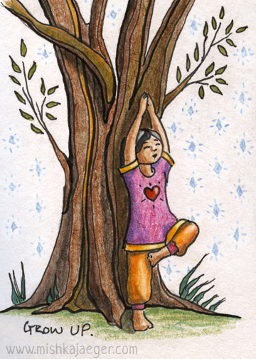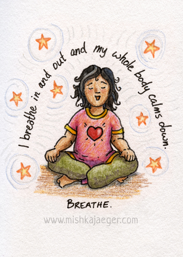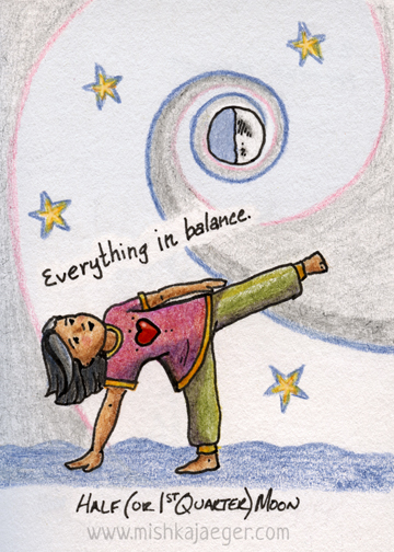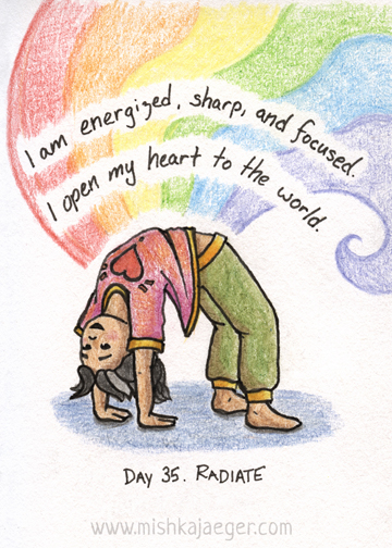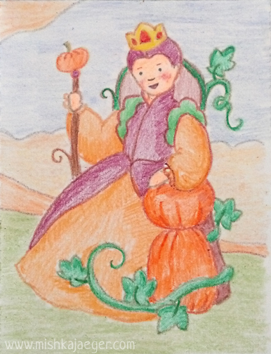
Somewhere around day 25 of my #100DaysOfSimple illustration challenge, I had the good fortune and timing (at long last) to take a day of yoga seminars with the amazing, effervescent, and inspiring, Tao Porchon-Lynch. The minute I walked into the room, I was overwhelmed by the sense of her tremendous positive and kinetic energy. It was as if a huge blanket of light was just hovering about navel-level across the entire room. I spent the day energized and open, amazed at how much the simple corrections she made to my postures changed so much in my practice.
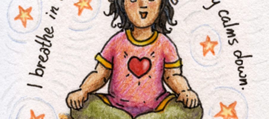
One of Tao’s co-teachers, Shizuko, also carries this wonderful energy with her. I showed her my little illustration challenge book and she suggested I draw an illustration of Tao, but I saw and felt Tao to be really so much younger in manifestation than she appears. When I got home, I felt inspired to illustrate a little Tao based on one of her many stories about her childhood. And just like that, I appear to have unlocked a little series I’ve been wanting to create that combines my love of yoga, spirituality, children, and illustration. I will be continuing this series with additional characters, poses, and philosophies.
I am beyond pleased and flattered that the ladies, Joyce, Shizuko, and Tao, asked to post my little yogi girls at the bottom of Tao’s workshop page.
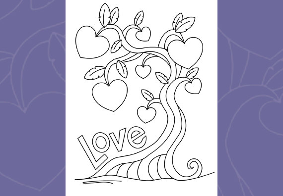
Just a little new art for February. This was a teeny tiny sketch that was intended to be just a coloring card. But it turned into this lovely thing as well so I sent it over to GCU. We’ll see if it’s approved in time for Valentine’s Day.
In the meantime, I’ve started working on some new coloring cards. The crayon cards were just not catching on so I switched back to the more traditional black line art. I’ve also got a more cohesive display going on now. The cards are starting to look a little like candy and that’s not a bad thing. I’m going to let my crayon style cards expire and then leave them off in favor of these new ones. These take a lot less time for me to make with a lot less frustration. So I can make a lot more of them.
This is how my little sketch turned out as a coloring card:
Sometimes the best projects begin as collaborations. In the past year, JaegerThing1 (now aged 3.5) has been asking me to draw cards for her so she can finish them. Mostly, we’ve put them on her friend’s birthday presents but we’ve also starting doing a few holiday cards, get well cards, and cards for friends who have moved away. She likes to finish them by doodling completely over the text with markers and putting as maky stickers on the front as she can fit. You might think I’d have taken a photo of these to post but I didn’t becaue I hadn’t had this brilliant idea yet. So stay tuned for a photo.
But now, to tell you about my brilliant idea. I had been trying to come up with a downloadable file project for my Etsy store that involved creative kid crafts. I’ve been making cards for my daughter. Hmmm. Why not make a bunch of half-finished cards to post for other kids to finish at home? Am I brilliant (don’t answer that)?
There are a lot of coloring pages and coloring books out there created with that comfortable and easy-to-do hard black outline. I didn’t want to do that for multiple reasons. Primarilly, I wanted the card to look kind of like the kid drew the entire thing themselves. It’s a bit of a cheat, but it looks a lot nicer to me than that hard black line. Second, when I was a kid, I HATED coloring inside the lines. Â Without that hard line, you can color right over the outline it you want. And you can change it’s color.
Yes, the other kids made fun of me because I wasn’t neat and pristine with my inside-line coloring. I still remember standing on a chair in the hall outside my second grade classroom to help color my team’s craft-paper Halloween pagent backdrop, and my classmates demanding I stop because I wasn’t doing the nice neat horizantal line coloring they all were doing. I was totally messing it up. Ok fellow classmates, lessons learned. I don’t always follow the rules. I still went on to get a degree in scenery design after that. But I digress.
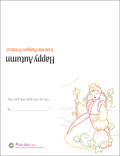
Third, you gotta get a gimmick! So Coloring Cards were born. I’ve started with a couple of autumny cards and will be making more for the winter holidays. I’ll be doing these for a very long time. If nothing else, I’m getting the illustration practice and learning what you shouldn’t attempt to do with a crayon (I mean on PAPER! I didn’t put the crayon up my nose, that honor goes to my one-year-old). Look for birthday cards, Valentines that work with Avery tear-off’s, and Thank You notes among many others I plan to post in the coming year. I’m currently offering cards on the same one-time purchase with and without inside greetings in case you want it blank inside. And you can print out as many as you want.
If you have any ideas for cards you’d like me to start for you or your child (or cards for holidays that I might miss like a Diwali card), let me know. If I decide to make them, they’ll be added to my store at the same low price ($.85!) as all of my other cards. To make the card, simply download the file to your computerand print it out on a letter size sheet of plain 8.5 x 11 paper. Fold the printed page in half from top to bottom, and then again from side to side. Go!
Continuing my project of bringing my older works up to date…
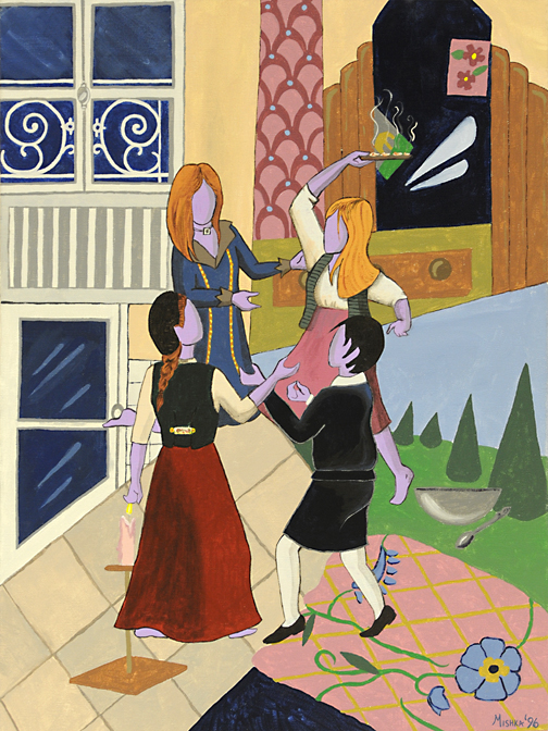
I’m really not sure if this piece ever had a title. It’s one of the few times I ever painted myself though. That’s me, the one in the long red skirt and beret. I’m pretty sure that braid was my trademark some 20-odd years ago, not that I ever knew it. My grandfather pointed it out to me once when I met him and my grandmother in Paris in 1992. I was studying theatre in London that semester and my grandparents took their last trip to Europe together, in part revisiting places where my grandfather had been stationed during and after the war. He described me coming up the street towards him with an enormous backpack and my pigtail swinging gaily behind.
It was during this semester that B came to visit my roommate in our London flat. B is the blonde on the right. Ever baking and concocting strange things in the kitchen, and even stranger plans. That was when I first met her but this painting is really of B’s apartment in Paris where I visited her a few years later. She was originally from Pittsburgh but moved to Paris after college and never looked back. She and I are no longer in touch, but the week I spent with her in that apartment, where I also met M (bottom right) and S (top left) made for some excellent 20-something bohemian artist-style adventures. We dressed funny. We went on crazy picnics in the park. We hired a car and drove to to the sea, and to Chartres where we lay on the floor looking up at the beautiful glass windows (I don’t think we were even asked NOT to!). And M and I bought a 3 day museum pass that had us touring the Paris sewers as well as Chopin’s house in our effort to see as many as possible.
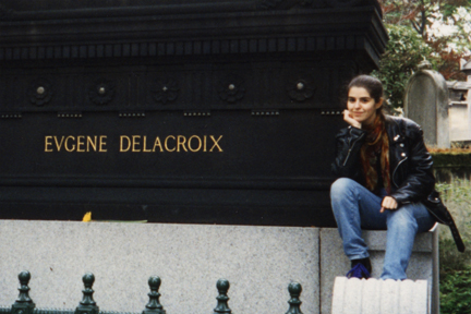
M and I also spent an afternoon visiting with all the dead artists and Abelard and Helouise at Père Lachaise. We never did find Jim Morrison though. I was much more interested in Delacroix.
That day I regaled M with all the grand ideas I had for my future. I had recently moved to Los Angeles. I had famous friends. I’d spent a summer working on a charity project for a mega movie star. I had plans. Or so I thought. what I had, in fact, was a muddle. I had no real direction and no plans at all, really, I kept taking the paths life was throwing at me instead. But I did have a lot of fun, angst, more adventures and, ultimately, experience.
Which brings me back here, revisiting my former artistic self like reading old letters.
Artistic notes about this piece: I painted the entire background before I overlaid the subjects which is why the placement is a little wonky and I have my hand in a candle flame. I thought about fixing it but figured it was probably allegorical. The background elements are all objects, patterns, and pictures from the flat. B really did try to paint the gardens of Versailles on one wall of the living room. She hadn’t finished it when I was there. Perhaps it’s all painted over now.
This painting is available as a print on deviantArt.
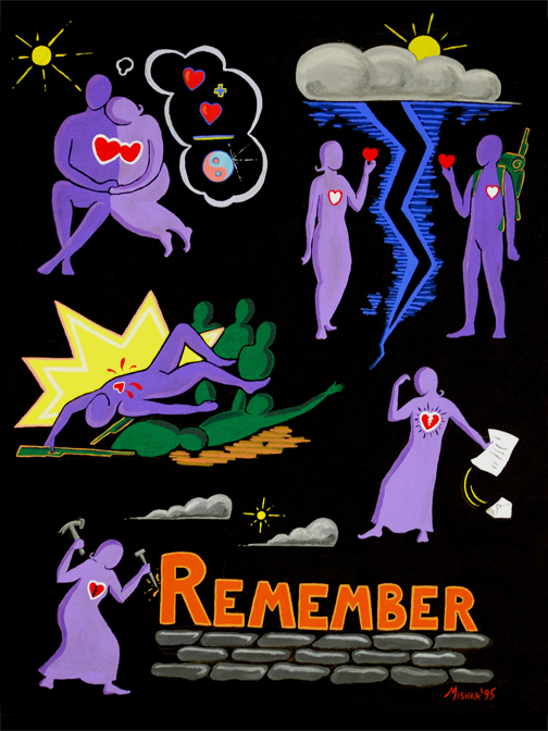
Continuing my project of bringing my older works up to date… This was the second of a series of acrylics I did back in 1995 that I called, “The Purple People.”
I did the original sketch for this piece on a trip to Israel in 1993. I was actually recovering from mononucleosis at the time so I wasn’t 100% in my focus but it seemed to me there were way too many memorials all over the place and that we were visiting pretty much all of them. This piece is pretty simplistic so I’ll let it speak for itself. And unfortunately, it’s theme is always current.
This painting is available as a print on deviantArt.
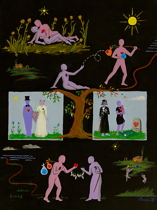
Continuing my project of bringing my older works up to date… This was the second of a series of acrylics I did back in 1995 that I called, “The Purple People.”
This painting is completely and unapologetically my rendition of the Sting song, Fields of Gold. I honestly don’t know the story behind the song, so this is the story I told. A young couple meet and fall in love. But they’re not in the same time and place for happily ever after. The man wishes to go off and see the world and the woman gives her heart to go along with him. But he doesn’t come back in a timely fashion. The woman does not want to be alone. She marries a man who loves her even though her heart is still absent. They do have a happy life together with children and grandchildren. He dies with a life complete. The woman, now old, takes satisfaction in watching her grandchildren grow and play and in the last years of her life, her heart returns. The man has returned from seeing the world with it’s weightiness behind him on his back and finally gives the woman his heart for good.
This painting is available as a print on deviantArt.