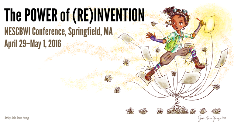
It’s hard to believe it was only a week ago that I was in Springfield MA, attending the NE SCBWI conference. Wow, what a fantastic weekend! I met great people, connected with “internet friends” (in person!), learned lots, got inspired, and now have quite a lot of work to do. I made a a bunch of mental notes to try and remember to blog about — I probably won’t get it all but hopefully I’ll get the interesting bits.
There were sooooooo many wonderful workshops to pick from when I registered. I had a hard time choosing them as I couldn’t be in two or three places at once. My only disappointment was not getting more time with Patrick Carman. He’s doing some amazingly innovative work integrating media but his keynote didn’t really go into this and I unfortunately had to chose other workshops over his.
Randomly (because if you know me, I often toss in something totally random) the best out-of-context quote I overheard all weekend was “Yes! She found her dongle in her chamber pot!” (I can only assume they were talking about Sarah Albee)
Tips for Storytelling
I’m not sure if anyone talked about “what does this character want more than anything in the world?” but I heard a few people mention it as something we should already know and then going on from there. Maybe that focus is already old news?
From Anna Staniszewski (The Emotional Heart of Picture Books)
- Be careful that you don’t write an idea instead of a story. You can have a great concept but it’s nothing without an arc.
- If your story has an emotional theme (heart), it should boil down to one unifying emotion overall. (This ties in nicely with a parallel through-line of action)
- “This story is about x, but it is REALLY about Z” (for example, Little Blue Truck goes out for a drive but it’s REALLY about the virtues of being a good friend.)
From Tara Lazar (Beginning, Middle, End – I’m bummed I had to miss the MIDDLE of Tara’s workshop for my portfolio review. Only slightly ironic.)
- Give the who, what, when and where but lead your reader to ask “why”?
- First sentences are your hook but a resolution need not be the end. What happens after “happily ever…?” (not strictly necessary, but it leaves room for a sequel) Also, don’t give away the farm. It’s ok to leave some things ambiguous.
- A great ending is inevitable – audience cannot imagine it ending any other way (this was repeated by several other presenters over the weekend).
- If your ending isn’t satisfying, the problem is probably in your middle.
- Children need to solve their own problems. No Parent ex machina.
From Aubrey Poole (Getting Outside Your Zone of Comfort: The Hero’s Journey applied to Character Development)
- Using the Hero’s Journey as an arc, a character enters an unfamiliar situation and has to adapt to it.
- Going outside the character’s comfort zone creates tension.
- Character wants something (it may not be his dream), pays a price for it (sacrifices his dream for it), and maybe gets a different version of it than he thinks he wants, concluding with a return to a “new normal” (falling action), the resolution having changed the character.
- Exception to this is the “steadfast character” who re-commits to who they are rather than changing who they are.
- Echoing Tara, If your ending feels flat, without emotional response, your resolution is unsatisfactory (again, a great ending is inevitable).
From Wendy Mass‘ Keynote (Getting from Here to There (and Back Again) with your Sanity Intact)
- (She used a lot of quotes and references)
- The best time to plant a tree was 20 years ago. The second best time is now. (Chinese proverb)
- Ideas come from 3 places; experience, observation, and imagination. – Paula Dansiger
- In order to write, you need to have faith in humanity, (paraphrasing Ray Bradbury) don’t watch the news.
- Writers write the kind of books they want to read.
- Interview your main character.
- Cut out unnecessary words (thank you, Stunk and White) and avoid any form of the verb “to be” (can someone please remind me which play that was in? I can’t ever hear that without being reminded of a play I saw in middle school…)
- “Substitute ‘damn’ every time you’re inclined to write ‘very;’ your editor will delete it and the writing will be just as it should be.” – Mark Twain.
- “Live as if you were to die tomorrow. Learn as if you were to live forever.” – Gandhi
- “Don’t look back, you’re not going that way.”
- And then she gave us all awesome waterproof notebooks made of stone because of course we all do our best thinking in the bath or shower.
From Partick Carman‘s keynote
- Neil Gaiman’s 3 things are not really correct.
- Don’t wait around, be an entrepreneur.
- Collaborate. You’ll often get where you want to go faster in a team.
Pitch Notes from Pitchapalooza
- A verbal pitch should last no more than 1 minute. A 30 second pitch is too short and tends to be too generic.
- I can’t wait to see what Rajani LaRocca does! That was quite an intriguing pitch (yes, she’s an MD).
- David and Arielle are fantastic at what they do.
Tips Specifically for Illustrating
 From Jarrett Krosoczka‘s keynote
- “Don’t do a $50 job like its a $50 job. Do a $50 job like its a $500 job and eventually you’ll be doing $500 jobs.” – Oren Sherman
- I’m a writer because I’m telling stories with my pictures.
- “Who pays you for that?” (What a great way to be a supportive grandfather (or parent)! Much better than “Get a REAL job!”)
- Send your postcards to the editors, not just the art directors.
- Words AND ART flow from left to right.
- As a kid, every year he was given a storage bin and told to save what was important to him (what a great idea).
Portfolio Notes
A quick thank you to Talia Levitt of Studio Goodwin Sturges for reviewing my work and giving me thoughtful and constructive feedback. I have a lot of work to do.
From Sarah S. Brannen (Draw Them In)
Sarah gave us A LOT of great information on how to present our work to optimal marketability.
- There is subjectivity as to whether or not you should put your contact information on the front of your postcard. Some say you MUST in case you get pinned to a wall. Others say it’s not a big deal to just turn the card over.
- Be careful not to include “portraits” in your portfolio. They don’t tell stories.
- Avoid showing character’s backs for sample art.
- An illustration needs to tell a story, make the viewer ask questions about what is happening in the illustration and what is going to happen next.
- An illustration needs to show emotion and relationship between characters (keep an eye on the eyes. The eyes have it!).
- Use motion and gesture.
- Details! Plenty of details (this was also mentioned in the First Look panel as well as Brian Lies’ workshop – see below)
- Details are even more important in fairy tales because we already KNOW the story.
- The technical execution of the piece and it’s medium is less important than the story it tells and the emotion it conveys.
- If an image is meant to be a postcard, make sure it works in a small scale.
- For a portfolio piece, it may be a good idea to leave room for text – a space where the text will obviously go.
- Be aware of the gutter. Don’t put important stuff in the middle of a spread (1/2″ at least).
- If submitting to magazines, review their formats and submit with those formats in mind (tall and skinny? side panels?)
- If there is something out there that you really want to illustrate, put samples of that in your portfolio. Show the work you’d like to do more of.
- Keep the style consistent. Push a style that is your signature. You will be hired for predictability.
- Another thing you are showing off in your portfolio is your design sense.
- Send postcards 3-4 times a year when you are first starting out, then twice a year when you’re more established.
- Don’t forget to send to junior editors and art directors. They keep boards too.
Illustration Games
Exercises similar to theatrical improv games that are meant to spark your creativity and enhance your skills.
Picture Dictation with Sergio Ruzzier
- In which we created 30 sketches in 1 hour. Wow, that was painful. Sergio gave us verbal prompts that we had to draw and timed us. I think some of the participants got a little frustrated but this was an amazingly liberating exercise.
- Our last assignment was to take 3 of these sketches and combine them into a 3-panel story or logical sequence like three mice meet a hippo and then go off to watch the sun set. I actually kind of like what I came up with and plan to finish it.
- This is a great exercise which, of course, we can all do at home, or over Skype, or something like that. We just need to make a list of 30 prompts.
From Dan Moynihan (Spark New Ideas with Drawing!” and “Pictures First! Draw Out Your Story”)
- “As I draw the characters, I learn about the characters.”
- Both of Dan’s workshops consisted of games. The first was really an after dinner game where we all drew in magic marker colors and passed our work around the table embellishing each other’s sketches.
- Our second game was constructing an illustrated story by passing work along after each spread. The results were hilarious. I pretty much forgot how to draw entirely right about then. Some of us presented these monstrosities to “the class” afterwards.
- The second workshop the following day was similar to Sergio’s in that Dan had us draw, but instead of different things we drew to the same prompt word over and over and over again in order to help find the story within our illustrations.
- And then we drew the same character over and over and over again doing different things. This is one way to learn about the character.
- I’ve always been more linear and had never thought to “draw out” a story this way but it totally works. You draw different sketches until they connect, piece them together until the story arc makes sense, then put them into the dummy and proceed to tighten them up.
From Brian Lies (The Angel’s in the Details: Going Beyond First-Order Thinking in Illustration World-Building)
Sidenote – I could just sit and listen to Brain read the phone book (if I still had one). He has such a great voice!
- Details give us information (historical, geographical, demographics)
- Details puzzle and delight us.
- Details take us away from the generic and tell us stories about the characters. Like props and costumes. We know people and characters by their “stuff.”
- Name (and nickname) your characters.
- Put in things for the “grown-ups” to find – especially when they have to read the book over and over again (and you want them to, right?)
- Convincing details lead to a convincing illustration – Mice wouldn’t have cheese wallpaper any more than humans have pizza wallpaper.
- Scale is important – A bear would write a BIG letter. A mouse would write a LITTLE letter. A bear’s letter in a mouse’s house would be pretty big.
- Brian gave us an exercise where we were to populate a portion of a character’s life with thoughtful details. This exercise taught us a little more about our characters (If you are a writer and don’t want to draw, you can simply make a list).
Finally… About the (my) Creative Challenge
And this one was definitely a challenge.
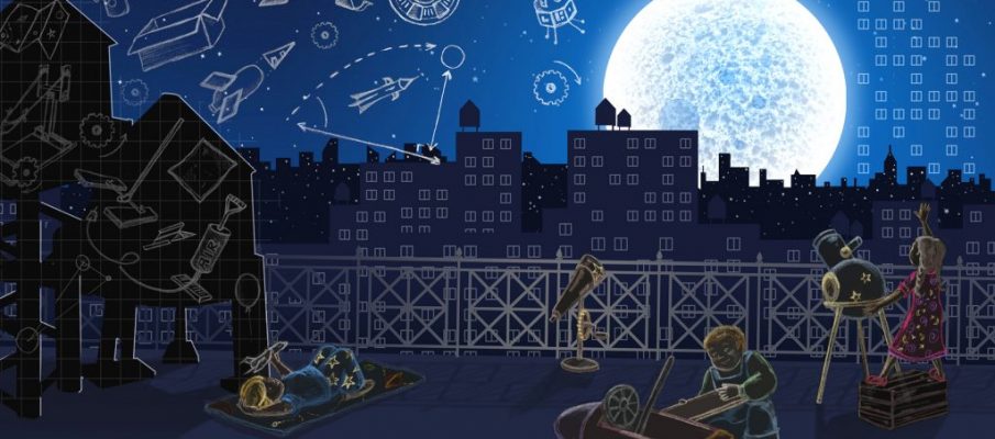
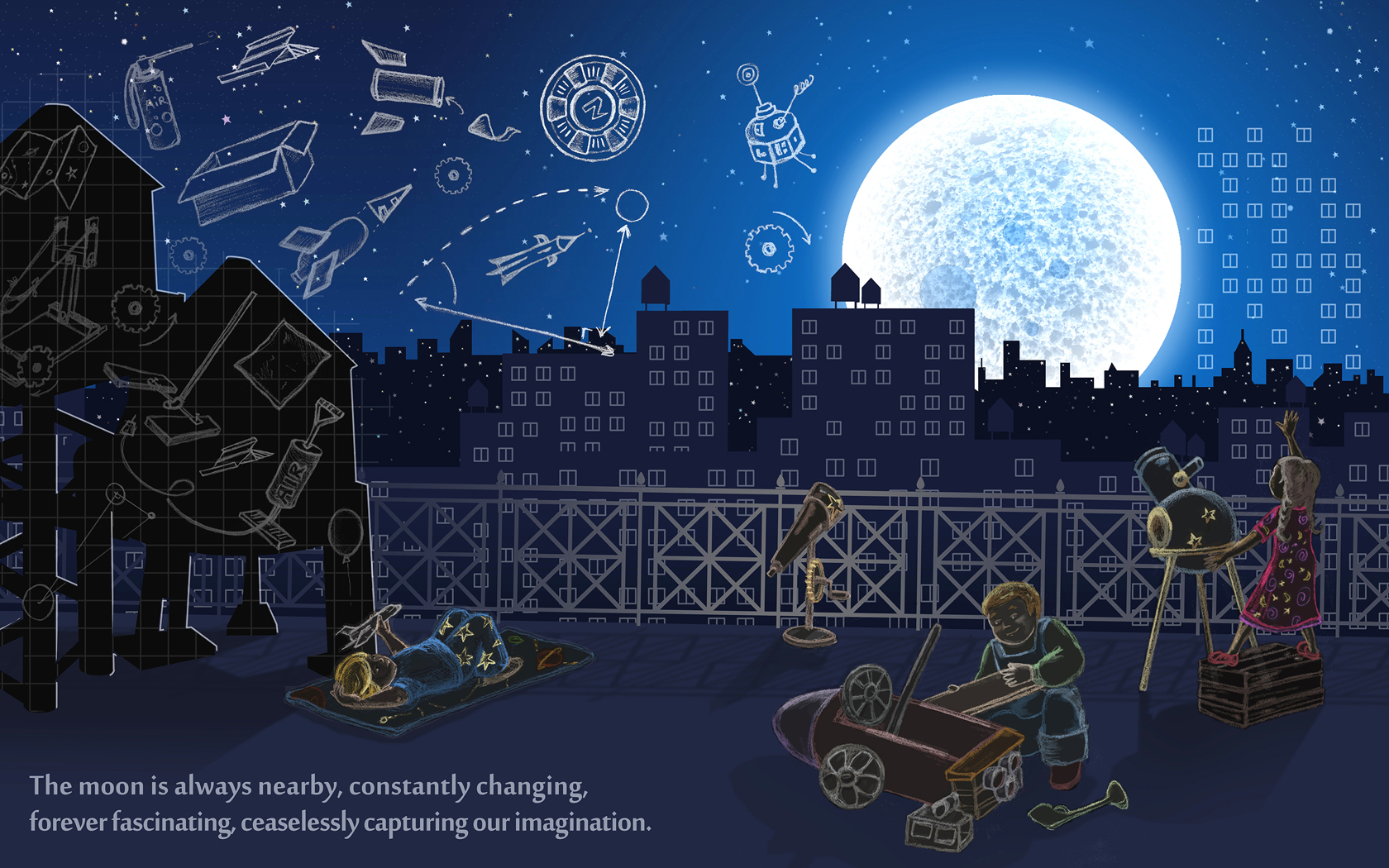
Before the conference we had to do the usual promotional prep work (cards, portfolios, in come cases buttons — I’ll have to remember that for next time! They’re just jingly fun to share). But we were also tasked with an illustration challenge to “Re-Invent Jules Verne. Choose anything written by Jules Verne and reinvent it, bring it into the 21st century. Anything goes, as long as it’s kid through teen friendly” at a double page 16″ x 10″ size. I picked From the Earth to the Moon. As part of my updating, I rewrote the quote.
I don’t consider this piece finished. I just ran out of time. And it’s got a lot of problems (hopefully I see more of them than you do!) but I do like it. I challenged myself to push a little more into the abstract layout than I usually go, mostly because of the Folger Theatre’s production of A Midsummer Night’s Dream. Seriously.
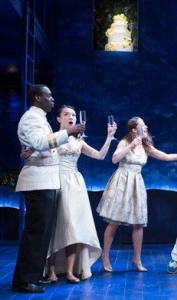 I realize that there is absolutely no obvious connection here. But it had to do with the stage set and the placement of a wedding cake high up in the back wall ABOVE the wedding scene. But it made the point. This was a wedding. And we didn’t question the placement. I had an “aha” moment. I’ve always been too straight-forward with my design. My set designs back in college were also always too… literal? I’m not sure when I got that grounded. I used to draw flying people like Chagall when I was a kid… Aha.
SO, I decided to try and break out of this a little and loosen up on this project. At which point the illustration started fighting with me. I wanted to do it in colored pencils, it wanted to be digital. We wrestled our way to a happy medium around an agreement on the concept. You may notice there are windows in the sky and stars on the background buildings? I’ve always been fascinated with city windows. Every time we drove over the 59th Street bridge at night, I would gawk as best as I could into the apartment windows at eye level, then look past them at the twinkling lights of Manhattan and think about all the people behind all those lights. The distance makes musing more poignant until it doesn’t matter if we’re looking at windows or at stars…
Next, I wanted to stay true to the concept of the story; that a group of people are trying to plan a trip to the moon. So my kids are out on the rooftop in various stages of planning or dreaming about how they’re going to get to the moon. Also, all the roof-top water towers of the city look like rocket ships. I’ve always thought so, anyway. Here’s where my Aha moment came in… I wanted to break the reality of my illustration and have the children’s plans and ideas floating above their heads to try and convey that this is what the illustration is really about. And I also wanted to make the plans LOOK like plans. So I inversed the graphite and added a grid to the water towers on the left that looks like graph paper. Continuing with the inversed graphite for the children and foreground was an experiment, and I’m afraid I cleaned up the lines too much on the right-hand side. I like the idea of what I did here better than my execution, but as I said, I don’t consider this piece done.
All in all, it was a good exercise for me. But it’s not the portfolio piece that the challenge suggested it might turn out to be. But I did get to scan a slice of bread for the moon texture.
In Conclusion
WHAT A FANTASTIC WEEKEND! I got to hang with some great people – I now have at least 30 new Facebook friends, enjoyed dinner with strangers who are strangers-no-more, Sharon Abra Hanen (who invited me to dinner by overhearing me say I didn’t yet have dinner plans), Sarah Ignatius, Lin Norman-Lyman, and Heather Steffens. I was privileged to spend quality time with folks who have been inspiring me from afar for years including Jane Yolen and Tara Lazar (who are BOTH hilarious in person), and Kelly Light and Heidi Stemple (whom I also know from social media and who are ALSO hilarious in person. I’m fairly sure Kelly and I crossed paths in college, and Heidi reminds me so strongly of my cousin that I’m quite positive we’re related), Jannie Ho (whom I “met” doing Illustration Friday 10+ years ago and finally got to meet in person!) Courtney Pippin Mathur (the only person I’d met “in person” prior to the conference because she lives near me!), Vita Lane and Jason Hart (for one of the most wildly coincidental lunches I’ve had in a while – Not often I run into someone who remembers seeing a play that I designed in college!) all my #KidlitArt friends (@emilywayneart @AutumnSeybert @reneekurilla @ClarElizabeth4 @ioanahobai @APSabourin @scillabert @juliaanneyoung @erniedelia @fultonbeal @matusic @sarahlynnereul @ClaireLordon @IllustratorPG1 @PSWCreative @AJSmithillustr, joshfunkbooks) and Marlo Garnsworthy (I’m sorry Carlyn couldn’t make it but happy she introduced us!), Jennifer DesAutels, and Roya (so lovely to meet you!!).
I know I’m still leaving many, many people out!
I got tons of inspiration and advice and some conflicting feedback about what I need to do next work-wise that I still need to parse… But now… back to my reality where I’ll be spending the next 8 months parsing this all out!

