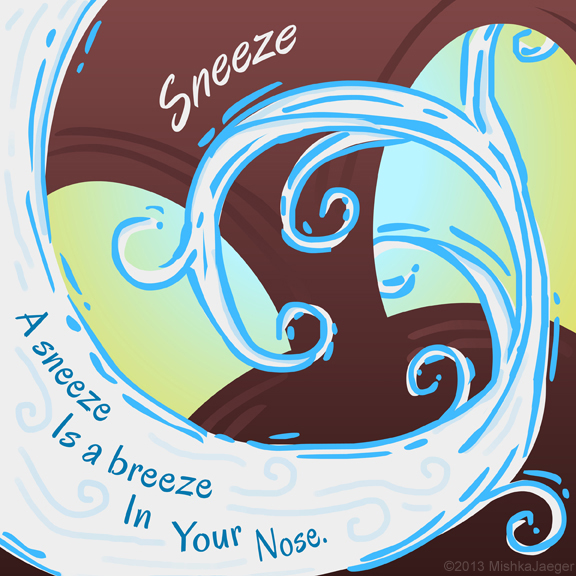
I just turned in my submission for the SCBWI Tomie DePaola Award).
As much as my final result looks to me like a bit of a scribble, this was actually a pretty hard challenge for me. I can only equate it to writing a short story or maybe logo design (which is not my strong suit). I’m glad I did this as it put me outside my comfort zone and pushed me a bit. Wow, I should do this more often. And yes, my brain hurts a little.
I really wanted to try out a few more iterations of design for this but I plum ran out of time as I have a lot of other things kicking around in my skull that need to be worked on. So here it is.
The challenge this year was to illustrate a poem for a book intended for babies up to two years old. I should be an expert on this target audience by now!
Media: Adobe Flash with a bit of help from Illustrator and Photoshop. Google Fonts’ “Oregano”.
Edit: 1/12/2014
Well… I didn’t even come CLOSE to winning the DePaola competition. In fact, I seem to have been in the group he specifically DIDN’T like. Hnh.
“The entries were all over the place. Here I am going to get a little critical. Some pictures were way too busy. Some bordered on the grotesque. I really worried that some images might have frightened little ones. There were a bunch of “up the nostrils†point of view. Really? But the thing that bothered me the most was the apparent need many of you had to illustrate an actual sneeze with all kinds of “stuff†flying out of noses. Hey, this is FLU season. Another note: Quite a few elephants – intriguing, maybe? Enough said.”
I’m not sure if I’m bristling or flattered considering I’ve been spending time with the target audience for a while now and dislike a lot of art in her board books. Why would a 2 year old be either frightened or grossed-out when most of them are digging about their own noses and some are eating their boogers at this age? Ah well, he did say to surprise him.
Like on Project Runway, you can please the judges and head for a commercial success, or you can please yourself and hope somebody “gets” it… or you can try and run the middle and somehow make what pleases you a commercial success. Somewhere, there’s a happy medium. This was a good thing for me to attempt.
Of the top picks, my personal favorite is Alice Ratterree‘s because I love her style of classic illustration.

