The days between Christmas and the new year are a time of reflection for most but for an artist… It’s the time of year where I scold myself soundly for dragging unfinished projects from year to year while simultaneously coming up with a bazillion new ideas for the coming one.
There simply are not enough hours in the day and I find it really hard to create new things when I’m surrounded by clutter. As part of my winter cobweb cleaning, I’ve decided to put all my fine art prints on sale until I no longer have any.
Seriously, guys, I need to clear this space. So if you’ve had an eye of one of my prints for a while, now is the best time to buy it from me. Everything is now listed in my new Square shop Hey, I already had Square so why not use it?
Many prints are available in multiple sizes – 5×7, 8×10, and 11×14 – and I’ll be showcasing a different illustration every day on social media. I had to set the prices on Square but if that’s too much, make me an offer. No, I’m not kidding.
Shipping isn’t included but I’m setting it at $4 for anywhere in the continental US. If you’re local to me, let’s make it an excuse to get together for coffee!
Help me clear out the old so I can make way for the new!
Deco Era Fairytales
My Artomatic 2017 Artist Interview
For Artomatic, we’re reviving the Artist Interviews.  These are written interviews that will appear only on our Facebook Page.  Please keep your responses in the question & answer format.
1) Who are you and how long have you been an artist?
Mishka Jaeger: I’ve been an artist since I could finger-paint with my mashed peas and pureed chicken. I love creating and I’m scatter-brained. I’m not sure if that’s a bug or a feature because my media are inconsistent. In general, I like telling stories through my art. My focuses are children’s’ book illustration, women, food, music, and spirituality.
2) What medium(s) do you work in & why?
Right now it’s colored pencil. I didn’t realize I liked it until fairly recently. I’d been struggling with mixing watercolor and digital art with moderate success but I’m not really a watercolorist. In 2015, I began a series of illustration challenges where I needed to work faster and be more portable so I thought I’d give the pencils a try. Turns out they’re awesome!
3) What is your creative process like?
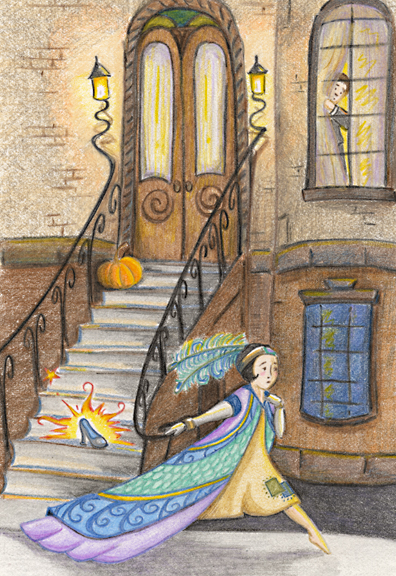
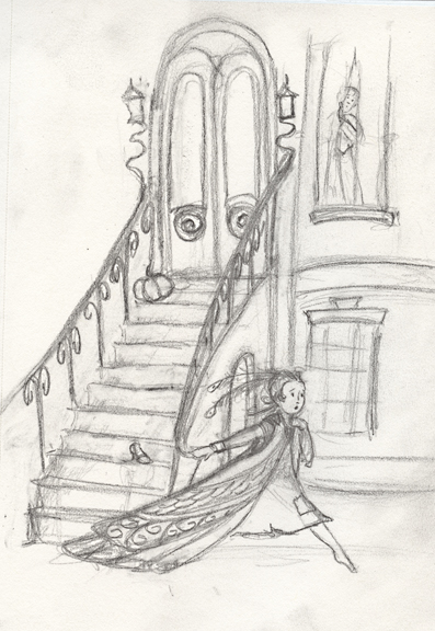
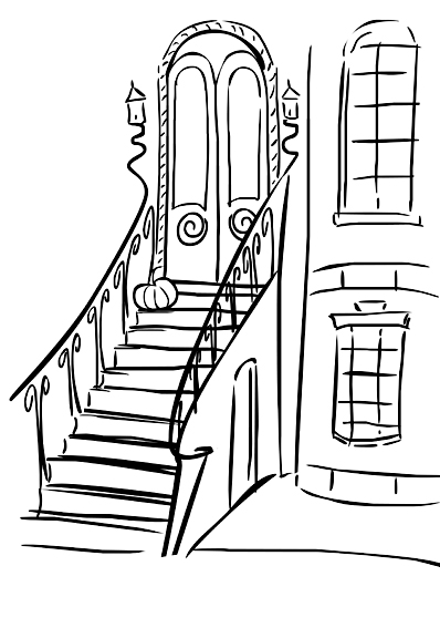
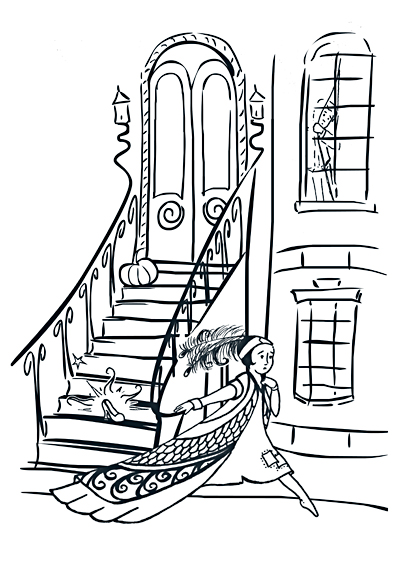
See “scatterbrained.†I tend to have too many ideas at once and many projects in the works at one time. I’m working on dialing in the focus and boiling everything down so I can be a bit more prolific. But I don’t really rough sketch. What purport to be my sketches tend to be more polished (which is why I’m showing some of them in my AoM display), and my sketchbook tends to look more like a journal. I often write out what I intend to draw instead of rough sketching because with rough sketching, I can’t always read my own visual handwriting later on. Once I’ve got a sketch that I like, I usually put it on the computer and noodle the layout around until I like it. A varying process of printing, light-boxing, inking, and re-digitizing are involved to clean up the lines. I use colored pencil over a 10% K-tone printout. I outlined this process in a little more detail while creating Art Deco Cinderella on my website blog in September 2015 (“Enchanted: A 1920’s Cinderellaâ€).
4) What is the best art-related advice you’ve received?
Really it’s from Jane Yolen who is an inspirational master of organization, focus and creation, and a phenomenal human being and author. Her main thing is “butt-in-chair.†That is to say, you need to do the work. You can’t do anything if you don’t do the work. After that, it’s that art is a business and if you want to succeed at it, you need to treat it as such.
5) What is the biggest challenge you face as an artist?
I still have small children at home, so actually finding the time, energy, and focus to do the work is a challenge. Apart from that, my challenge is to generate a following and then monetize my work (you wanted honesty, right?). I need to tell a better story so that people want to hear more from me. And then I need to tell it louder.
6) Choose one piece that you currently have on display at Artomatic and tell the story of that piece:
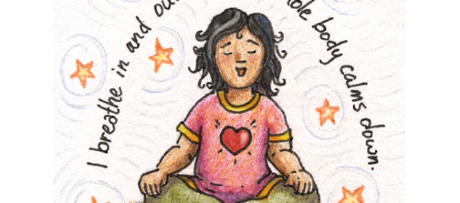
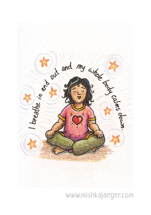
I’d been working through the 100 Days project when I had the privilege of attending a workshop with yoga master Tao Porchon-Lynch who turns 99 years old this August. She told us many stories about her childhood in India between the wars. One of her more popular stories was that she’d lie on the ground and listen to the grass grow. She said she could really hear it. That story inspired the first of my Little Yogi illustrations, and I drew my version of a young Tao lying and listening to the grass. Later that week while cleaning out my 20 years of magpie-collected papers, I turned up a bookmark that read, “I breathe in and out and my whole body calms down.†It was fortuitous. Now there are two things I strongly believe we need to do to live happier, healthier lives. The first is to get a good night’s sleep (and I’m still not so good at that). The second is pausing to breathe mindfully. It gives you time to think before you act, and deep, slow breaths do calm you down. So “Breathe†became my next Little Yogi. Now you can have a card to remind you to breathe too. Pick one up in my AoM space #3402 behind the theater.
7) What is your favorite part of the Artomatic experience so far?
It is always meeting new local artists, seeing what they’re working on, seeing what we have in common, and learning from their work and creative processes.
8) How can people find you online?
Always by my name:
https://www.facebook.com/mishkajaegersketchbook
https://www.etsy.com/shop/MishkaJaeger
@mishkajaeger on Twitter and Instagram
Read more about my Artomatic 2017 Show…
Entering the Tomie Depaola award 2015
Red Riding Hood
This year I swore I wasn’t going to enter the Tomi Depaola competition again. It was too much aggravation and hassle the last couple of times. I’d put it off until the last minute because it wasn’t a priority – until, of course, it suddenly was. Like many of my peers, I also got the distinct impression that “Tomie just doesn’t like my work” (don’t ask why we all feel that way – chalk it up to artist’s insecurities). Lastly, Mr. Depaola has been frustratingly less than punctual on his end of the deadlines as the quality of the work always makes it hard to pick a winner. It’s his competition. *shrug* So I wasn’t going to do it.
And then I read the prompt:
One of the biggest and most important challenges the Children’s Book Illustrator faces, over and over again, is the UNIQUE VISUALIZATION of the MAIN CHARACTER.
So often, I have seen illustrators resort to generic depictions of the star of the story–too “designed,†too ordinary, too much like characters already seen in media, especially on TV and video games.
The assignment is simply to illustrate a moment from the following passage from Philip Pullman’s version of “Little Red Riding Hood†from FAIRY TALES FROM THE BROTHERS GRIMM (Viking, 2012). (You may want to read the entire story. It is an excellent book.)
And immediately sketched a rough draft inspired by:
Once upon a time there was a little girl who was so sweet and kind that everyone loved her. Her grandmother, who loved her more than anyone, gave her a little cap made of red velvet, which suited her so well that she wanted to wear it all the time. Because of that everyone took to calling her Little Red Riding Hood.
One day her mother said to her: ‘Little Red Riding Hood, I’ve got a job for you. Your grandmother isn’t very well, and I want you to take her this cake and a bottle of wine. They’ll make her feel a lot better.
My rough  draft inspired my last couple of fairy tale illustrations set in the 1920’s/’30’s. This time I tried not to leave it until the last minute, but life interfered and my idea of what I wanted to draw wasn’t jibing with how the characters wanted to be drawn. After a bit of arguing, I gave in (the characters usually know best anyways).
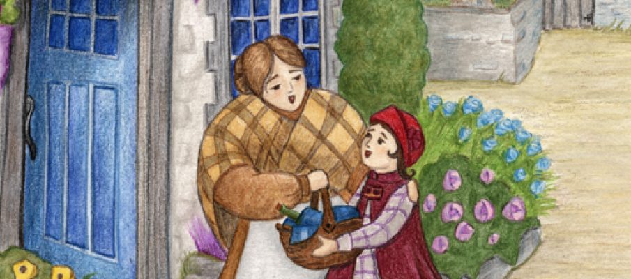
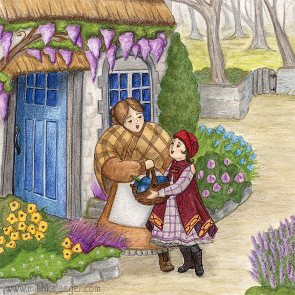
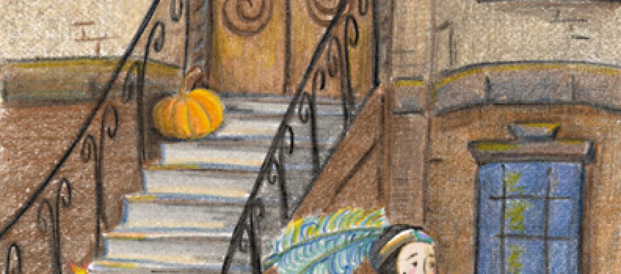
My setting is 1920’s northern England, though the cottage is much older. I wanted Red to look a little more modern as she wants to someday become a “woman of the world,” while her mother is comfortable wearing the older, rustic fashion. Red’s world is comfortable, happy, and cosy. The world beyond the gate begins the misty, ominous forest.
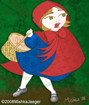
Mr. Depaola has an excellent point… we all think of Red Riding Hood looking the same way in an 18th century travelling cape, no matter what time or place she’s set. The last time I drew Red back in 2008, this is what she looked like, captioned, “This is my rather standard treatment of Red Riding Hood.”
So far, a number of my colleagues have shared their entries to the competition in the PB critiquie group on Facebook. All I can say is that once again, Mr. Depaola is going to have a seriously hard time picking a winner. I’m personally blown away by my competition. Winning would be nice, but I really entered because the topic was inspiring. And I think I produced a pretty darn good illustration.
Reflection: A 1930’s Snow White
Do you know what the enemy of “good” is?
It’s “better.”
A little about the piece:
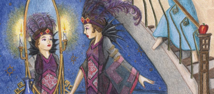
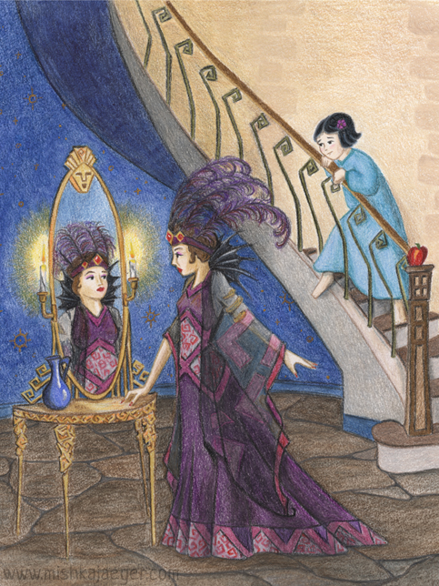
This piece is “Snow White and the Queen.” I’m continuing on my theme of fairy tales set in the early-ish 1900’s with a more theatrical Art Deco, old Hollywood setting.
I wanted to keep a little of the light = good/dark = evil symbolism as well as the hints of Snow White with a cobalt blue “Depression-Era” pitcher containing… something unknown and possibly vile, and of course the apple on the newell post.
I am not sure where the idea of the talking face in the mirror came from in the traditional Snow White depictions – possibly Disney? But my molded face atop the glass worked perfectly with the Art Deco design.
This mirrored dressing table is based on the silhouette of a piece I found on Google images but I changed the design to gold hard-edged roses. I also used this design on the Queen’s dress and the bannister.
Other Notes:
Today is the deadline for SCBWI’s November Draw This! showcase. As I’m still easing into colored pencil techniques, I decided to try mixing it up a little bit and combined regular pencils with some blue Derwent ink pencil and regular Derwent watercolor pencil (which I also just discovered I own – it would seem I’m an art supply hoarder). I Â also got a water brush. What a concept! I’m still undecided on the paper. I used Strathmore Bristol 400 which seems to have a bit more tooth than I’d like.
Because I was trying some new things, I dragged my feet a little. I didn’t want to screw up what I’d already done by failing at new techniques. Also, I still haven’t really pushed my contrast as much as I could. I realize I’m being timid about it and I see a couple of things I could have done better to add a bit more drama.
Tonight, after we got the kids to bed, I figured I’d put the finishing touches on the piece before submitting it and decided the wall behind Snow looked a little bare. So I drew in some stones. Being tired from Jaegerling2 being up part of the night (he’s 2… maybe he’s teething those last molars?) I drew the stones rather ham-handed and a bit too dark.
Oh fudge. That’s it. Time’s up. Pencils down.
Luckily, it was a fairly straighforward clean-up in Photoshop. But I’m annoyed about it because I deliberately used gold opaque watercolor on the “wallpaper” pattern because I wanted the original to look really cool and shiney. I knew full well the gold would scan in umber tones (I’ve at least done THAT before).  So the original looks really bright and colorful — the digital reproductions never really capture the depth of the color we achieve on paper — except for those dang stones.
Oh well. Call it “done” and move on.
All in all, I do like how it turned out. Though it probably could use a cat. There was a cat in my original sketch but he seems to have wandered off.
Enchanted: A 1920’s Cinderella
Sometimes when you’re tired, you do and say dumb things and then you *facepalm* and groan and hope you didn’t screw up too badly. I really need to get the littlest Jaegerling’s sleep schedule and my own to be better aligned (he’s two. what can I say?).
Anyway, Penguin childrens’ book art director and mentor Giuseppe Castellano hosted a #twitterclass where he gave some really great twitter critiques of every illustration submission he received between 9 and 10pm. I was tired and had found out about the “class” 5 minutes before it began so I was more focused on quickly finding something recent and remotely critique-worthy to post than editing my tweet to say exactly what I meant. I wrote “Still working towards style.” By “style” I really meant a flow, an ease of technique and process. I didn’t mean my own personal voice. It was a poor choice of word. *Facepalm.*  Mr. Castellano referred me to his blog post on style (which I had already read) that’s pretty much about why he dislikes the word.
After I got over feeling stupid, I read the rest of the critique tweet. Mr. Castellano also mentioned that my drawing looked too outlined and that the colored pencil wasn’t working well with the paper. True and true. I have been using cheaper materials, working on the theory that if I could make something nice with cheaper materials, I should be able to make something even better with GOOD materials. I also wanted to make sure I even wanted to continue with pencils and explore the feel of other brands before I invested a hundred or so dollars in a standard Prismacolor set.
I do have other materials in my cabinets, though. So I dug out some Bristol and unearthed a set of Mitsubishi colored pencils that someone (probably my artist aunt) had given me years ago, grabbed a sketchbook, and set to work on a pice for the SCBWI “Draw This” monthly challenge for October.
I only left myself 2 days to produce something so I challenged myself Project Runway style. Make something work. The challenge word is “Enchanted.” Go.
Because I’ve been focusing on my process (and not because this is a masterpiece by any stretch), I’m going to step through what I did to create this piece. I welcome any professional advice on the media and my process because I’m still learning by doing (and probably always will be). This piece reflects some of the skills I’ve been working on in my #100DaysOfSimple project. I’m working faster, a little looser, and with a little more line efficiency than I had been previously.
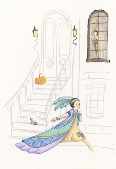
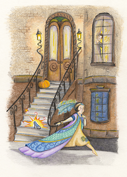
I don’t remember why but I had been looking at some Erte prints recently so I felt a little deco-inspired. Not sure why I picked Cinderella but that’s what came to mind. I deemed my third sketch satisfactory. The rest of my procedual notes are in the captions of the slideshow below.